Step 1
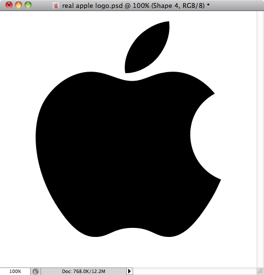
I started by getting a vector version of the logo so I could make a shape layer on photoshop.
Step 2
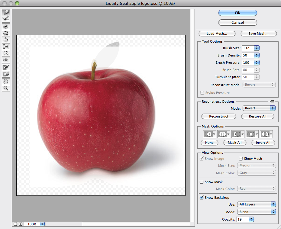
Then I found a photo of an Apple to use as my base.

Step 3
Using the liquify tool I morphed the Apple close to the shape of the logo.
Step 4
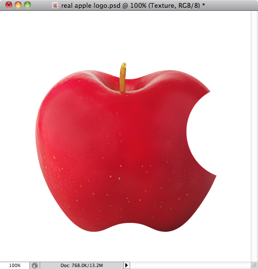
In order to give it an ultra realistic feel to it, I adjusted the saturation, removed the original glow, and used smart blur and the clone tool to only keep the most prominent details of the apple. Then I masked it into the shape of the logo.
Step 5
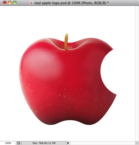
With the brush tool I added highlights and shadows to the shape to accentuate the volume.
Step 6
I morphed the leaf with the liquify tool to make it come close to the original logo shape. I found that if I was 100% faithful to the shape it just looked too fake, so I retained some of the original leaf shape.
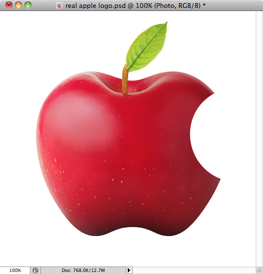
Step 7
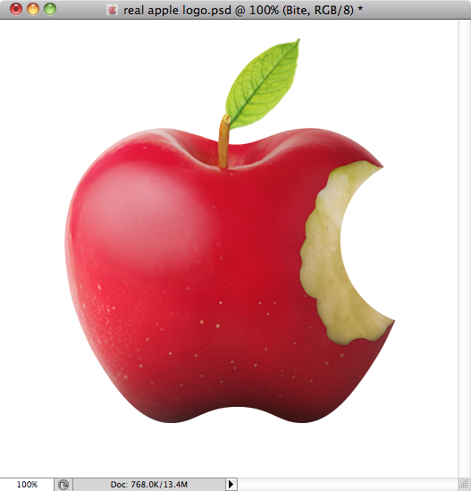
Now the actual bite!
I found a picture of a bitten apple and masked it into this hand drawn shape. I also added a bit of a shadow around it and inside it to give it some contour and depth.
Step 8
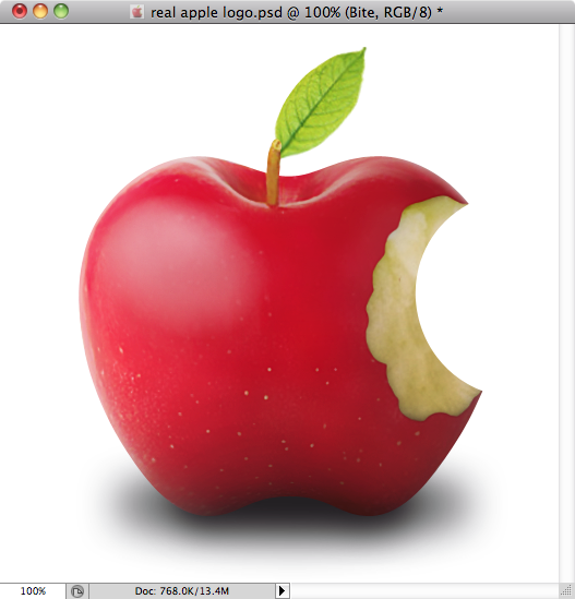
Finally I added the floor shadow and voila!
Step 9
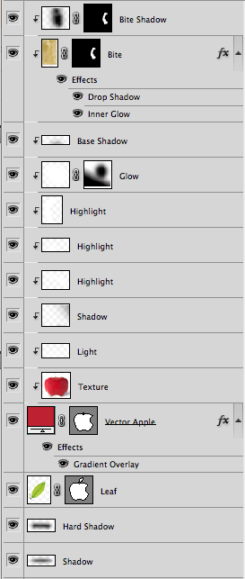
Here are my layers… I like to keep my highlights in separate layers so I can control individual opacity as well as the filter.
Conclusion
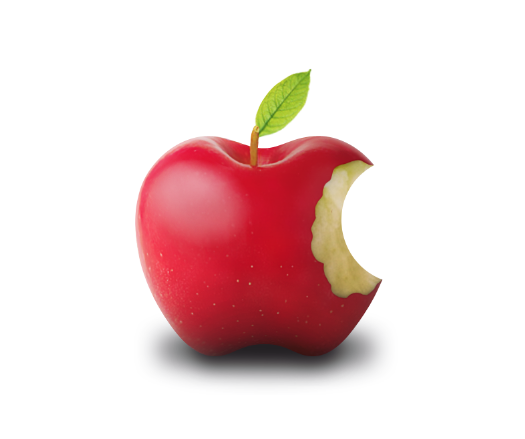
Here is the final result. You can share your opinions by leaving a comment or visiting my Dribbble profile.


No comments:
Post a Comment