Search box

click

Tuesday, September 27, 2016

Stranger Things Logo - Photoshop Tutorials

                     first:- click here

Step 1

Open Photoshop and create a new document. I am using 1920x900 pixels. After that fill the layer with a gradient #000000 and #303030 for colors and tilt it for better effect.
Tutorial: Stranger Things Logo

Step 2

Go to filter > blur > gaussian blur and fill with 100 for radius.
Tutorial: Stranger Things Logo

Step 3

Add a new layer above it and fill it with #d91f26. Set is blend mode to Multiply.
Tutorial: Stranger Things Logo

Step 4

Time to add some text. I'm using the original logo font, called Benguiat. The weight is bold. You can buy it at MyFonts, or feel free to use a bold, serif font of your choice. Adjust the text so that it has 2 lines, the top one being wider than the bottom one. Turn all text black (#000000).
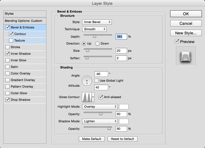
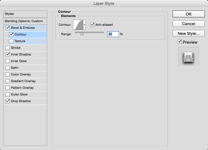
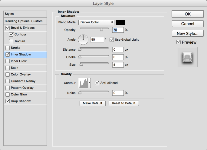
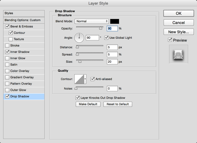
Tutorial: Stranger Things Logo

Step 5

Group the text. In its blending options add a stroke of 10px, #d91f26 for color.
Tutorial: Stranger Things Logo

Step 6

Inside the group add 3 black, rounded rectangles, a wide one at the top and 2 smaller ones at the sides. Duplicate this group and turn the copy invisible, because we'll save it for later.
Tutorial: Stranger Things Logo

Step 7

Add a new layer below the visible group and fill it with #000000.
Tutorial: Stranger Things Logo

Step 8

Merge the group with this new black layer.
Tutorial: Stranger Things Logo

Step 9

Set the blending mode to Color Dodge.
Tutorial: Stranger Things Logo

Step 10

Duplicate this layer, and set the blending mode of the copy to Overlay.
Tutorial: Stranger Things Logo

Step 11

Turn visible the copied group from ealier. Make its stroke thinner, from 10px to 8px. Add a new layer above this group.
Tutorial: Stranger Things Logo

Step 12

Merge the new layer with this group. Go to filter > blur > gaussian blur. Set it to 1px and apply.
Tutorial: Stranger Things Logo

Step 13

For its blending mode, set it to Color Dogde, and Opacity 50%.
Tutorial: Stranger Things Logo

Step 14

Add new layer. Using a round brush add some strokes covering the logo.
Tutorial: Stranger Things Logo

Step 15

Add a gaussian blur of 100px to these strokes.
Tutorial: Stranger Things Logo

Step 16

Blending mode: Color Dodge, Opacity: 30%.
Tutorial: Stranger Things Logo

Step 17

Merge all visible layers. Duplicate it.
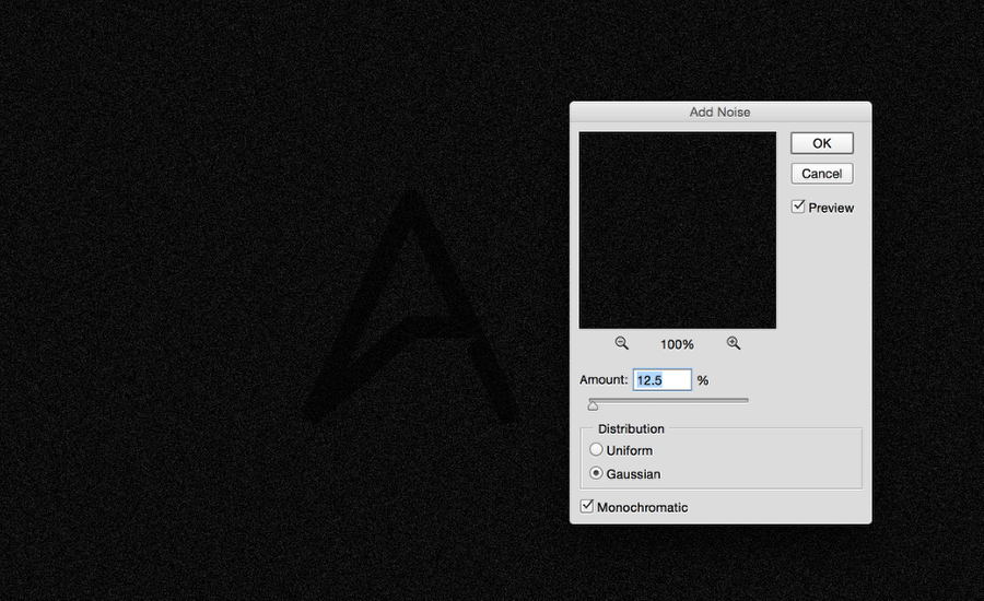
Tutorial: Stranger Things Logo

Step 18

Add noise to the top layer. Go to filter > noise > add noise. For values use Amount: 5%, Distribution: Gaussian, Monochromatic.
Tutorial: Stranger Things Logo

Step 19

Set its blending mode to Overlay, Opacity 70%.
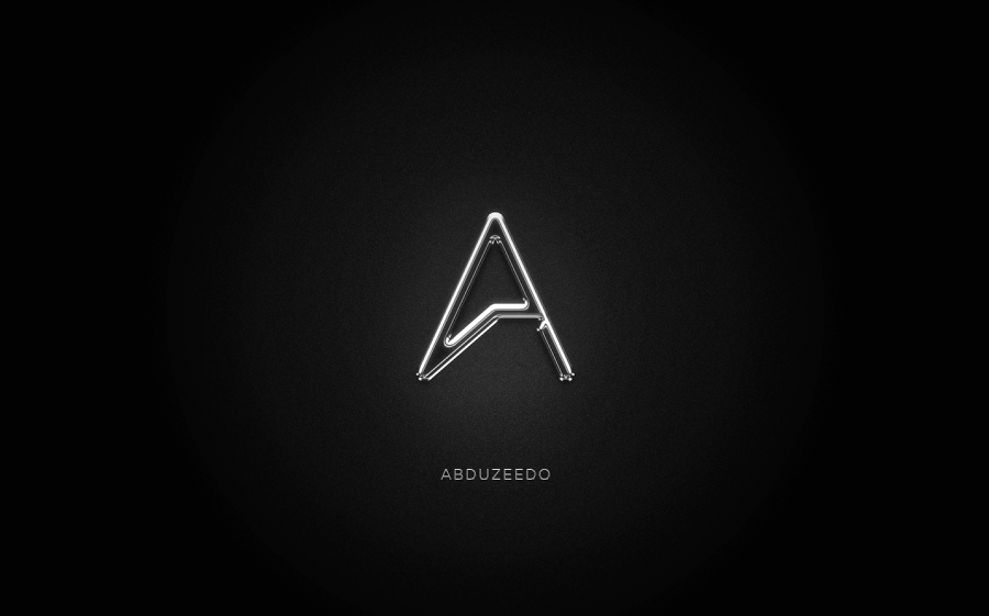
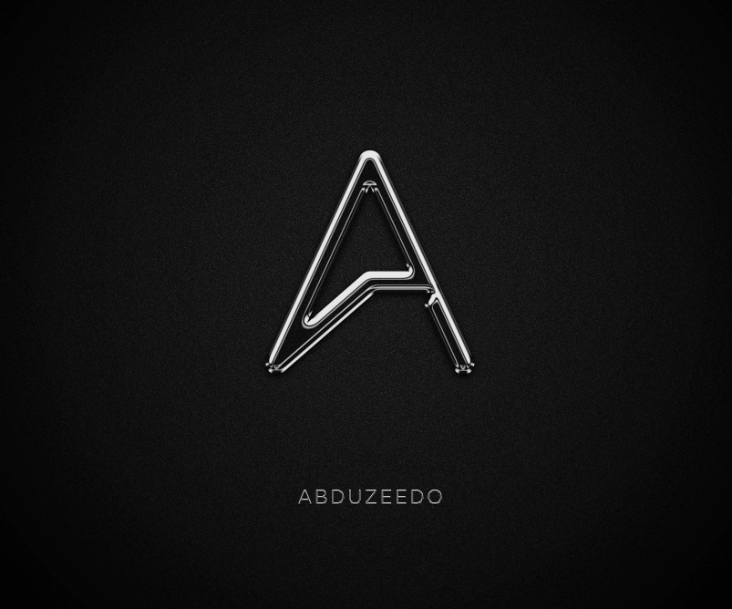
Tutorial: Stranger Things Logo

Final Result

I know the final result it's not a clone of the original style, but it mimics the original pretty well. I hope it inspires you to keep trying to perfect it and even make a perfect clone.
Tutorial: Stranger Things Logo

Thursday, September 15, 2016

Ode to the 80s - Photoshop Tutorials

Classic 80s Style Logo

Step 1

To create the 3D effect I used Illustrator's Blend Tool. I feel that it might be the quickest way to get a nice extrusion, especially for this particular type of graphic. CGI in the 80s was still evolving and playing with basic geometries.
Classic 80s Style Logo

Step 2

Now in Photoshop I created a document and the background I set to black.
Classic 80s Style Logo

Step 3

Paste the vector in Photoshop, make sure you use Smart Objects. It's always good to be able to make mistakes and just change fix it withouth much hassle.
Classic 80s Style Logo

Step 4

Now for the top part let's add some nice gradient from blue #0000ff to a very light blue.
Classic 80s Style Logo

Step 5

Duplicate that layer and then add some Layer Styles to create the bevel and stroke effects. The images below show the values.
Classic 80s Style Logo

Step 6

For the complementary text I used a font that I found on DaFont, a super cheesy one that has all of that 80s feeling. The font is Las Enter Font (http://www.dafont.com/lasenter.font). Just add your text and with Layer styes add 2 drop shadows. The first one white and the second black, that will create a nice bevel effect.
Classic 80s Style Logo

Step 7

Now for the background let's apply a gradient. Get some of the colors from the logo to make it look like the logo is sort of illuminating the background.
Classic 80s Style Logo

Step 8

Select the 3D extrusion layer and add an Adjustment Layer Hue and Saturation. The idea hear is to add a bit more Saturation, Brightness and Hue.
Classic 80s Style Logo

Step 9

The classic reflection of the 80s, you can do that very easily by creating a sort of wavy selection and then create a layer to apply the same gradient that the text has.
Classic 80s Style Logo

Step 10

Now it's that time, the little flares that are part of that beautiful decade. To do that is quite easy, create a new folder on your layer palletes and add a new layer in this folder. Change the folder Blend Mode to Color Dodge. Then select the layer inside and with the Brush Tool and a very soft brush you can just create some dots with white color. The result is a quite awesome light effect.
Classic 80s Style Logo

Step 11

To add a bit more mood to the scene I just added some smoke using the Render>Clouds. Then change the Blend Mode to Linear Color Dodge. Also add a Layer Style with a Gradient Overlay. Use Linear with blue at the top and purple for the bottom.
Classic 80s Style Logo

Step 12

It would not be an 80s graphic without the classic scanline effect. I created a pattern with 2 rectangles, a black and an white. Then I filled a layer with this pattern and placed on top of all the other layers using Soft Light for the blend mode. I also applied a super soft blur.
Classic 80s Style Logo

Step 13

To add a bit more texture I added a new layer and then filled it with white. After that I went to Filter>Pixelate>Pointilize. Then just change the Blend Mode to Overlay at 10%, it's very subtle but you can notice the difference.
Classic 80s Style Logo

Step 14

I always like to add a bit of a warm feel to the image. For this particular one I just added an adjustment layer Photo Filter on top of all the other layers.
Classic 80s Style Logo

Step 15

To finalize the image I added some lightning bolts. I used an image I found on Google Images. I also adjusted the flares to match where the bolts intersect with the logo.
Classic 80s Style Logo

Step 16

The last thing I did here was just to duplicated all layers and merge them onto a new one. Then I applied Gaussian Blur with 20px for the amount and after that I just changed the Blend Mode to Hard Light at 60% Opacity.
Classic 80s Style Logo

Conclusion

Here's the final image. I added a grey solid layer on top at 10% Opacity to create a little Fade effect and that's it. As you can see, it's not a really complicated effect, it just require some trial and error and time to go through all steps. I even played with some color variations like an all red one.

Classic 80s Style Logo
copied from:- http://abduzeedo.com/

Chrome Effect - Photoshop Tutorials

Chrome Effect in Photoshop

Step 1

In Photoshop create a new document. I am using 2880x1800 for the size so I can use it as a desktop wallpaper for my laptop. After that put the logo/symbol you want to apply the chrome style.
Chrome Effect in Photoshop

Step 2

Add a new layer and fill with with black with the Paint Bucket Tool. After that go to Filter>Noise>Add Noise. Use 12.5% for the Amount, Gaussian and Monochromativ.
Chrome Effect in Photoshop

Step 3

Duplicate the layer and for the one on top go to Edit>Transform>Flip Horizontal. After that change the Blend Mode to Screenat 40%.
Chrome Effect in Photoshop

Step 4

Group the 2 layers with noise and then for the group apply a layer style. Select Gradient Overlay and use Radial with a light grey in the middle and black for the edges.
Chrome Effect in Photoshop

Step 5

Select the symbol and then go to Layer>Layer Style>Blending Options. Use the settings like the images below. Note: The settings might vary depending on the type and size of you symbol, so play with the values until you find the best result. These are the best settings for the Abduzeedo symbol.
Chrome Effect in Photoshop

Step 6

Here I added the logotype and apply similar chrome effect.
Chrome Effect in Photoshop

Step 7

Select all layers and duplicate them. Merge all the new duplicated layers onto one layer and then go to Filter>Blur>Gaussian Blur. Use 15 for the amount. After that change the Blend Mode to Screen at 50% and go to Layer>Add Layer Mask. With the Brush Tool make only the symbol area visible so this layer will create a sort of glow effect.
Chrome Effect in Photoshop

Conclusion

Here is the final result. As you can see the last step add a nice shine and glow to the image making the chrome look more realistic. I mentioned before, but it's important to play with the settings because they might have different results depending on the form of your symbol. Now it's up to you, just have fun and start creating nice wallpapers as well.
Chrome Effect in Photoshop
copied from:- http://abduzeedo.com/